Monochromatic interiors often go one of two ways – either they come out over the top and overdone, or the final result is sleek and elevated. Getting the balance between bold color and timeless refinement down is more tricky than it looks, and bringing the all-one-hue look home isn’t for the faint of heart. But when special attention is paid to rich textures, considered finishes, and every last detail, the monochrome look is truly hard to beat.

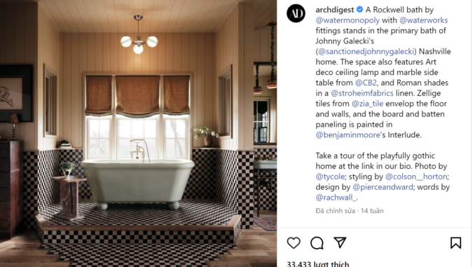
Johnny Galecki’s luxurious bathroom, designed by Pierce & Ward, is a stunning example of a monochrome color scheme at its best. Making use of ambient lighting and glossy accent tile to complete the look, the Roseanne actor’s space is calming and classic.
‘Johnny Galecki’s bathroom is a masterclass in monochrome design, showcasing how thoughtful choices in color, texture, and material can transform a simple bathroom into a serene and stylish retreat. This elegant space is not just about black and white; it’s about the sophisticated dance of light, shadow, and texture that makes monochrome anything but boring,’ says Nina Lichtenstein, founder and principal designer at her eponymous firm.
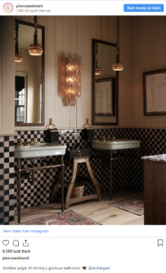
Johnny’s bathroom features soft and sculptural light fixtures that illuminate a carefully selected and paired range of finishes. From simple wood paneling to shimmering, checkered tile layout, the light plays differently with every surface throughout the space. Interior designer Kathy Kuo says this combination of light and pattern creates ‘visual contrast’ that makes the monochrome look more appealing.

‘Though the color palette itself is very minimal, the statement-making wall lighting and ceiling lighting create the illusion of a pop of warm color, and the checkered tiling on the lower part of the walls is bold and eye-catching without being overwhelming,’ says Kathy. ‘The metallic elements in the sink hardware and the towel rings add just the perfect pop of understated glamour.’
The bathroom isn’t typically the most homey, inviting room of the home, but this space blends washroom functionality with comfort-forward design beautifully. Earthy colors found in the wood flooring, woven trash basket, and marble countertop, ‘ground the design,’ adds Nina.
‘These natural textures provide warmth and add an organic feel to the otherwise structured and polished space. The variety of finishes – from the sleek metal of the sinks to the soft fabric of the pendant lights – creates a rich composition that is both visually appealing and tactilely engaging,’ she says.

The actor’s bathroom takes on a neutral, warm beige hue that leans a bit moody, but bathrooms can benefit from monochrome design schemes across the entire color wheel. If you’re loving the all-one-hue look but don’t want to go quite so dark, Helen Shaw – international director of marketing for Benjamin Moore – suggests a classic black-and-white palette to start.
‘Embracing a monochromatic paint scheme is a fantastic way of creating a chic, minimalist look in a bathroom. If working with a smaller bathroom, embrace a clean white color scheme to open up the space, then use accents of black on paneling, skirting boards, or as a linear divide to the room to make a real statement,’ says Helen.